Metis Week One - Project Benson
My first week at Metis is done! So far it’s been exactly what I wanted and expected: fast-paced, demanding, and practical.
My Metis cohort is composed of approximately 25 people. Everyone, and I mean everyone, comes from a different background with a good sprinkle of international students. We have backgrounds in finance, business, math, neuroscience, software engineering, retail, a few PhDs and MBAs, and more. Some people come in with programming skills in certain languages already, some don’t. Some people come in with some stats skills and some don’t. Everyone brings something different to the cohort.
During the first week, a typical day was composed of pair programming (small challenges that we all work on in pairs and then talk about as a group), lectures, and project work. This week’s lectures were mostly focused on pandas, a python package for data analysis, as well as on a quick overview of matplotlib and seaborn, python plotting and data visualization libraries. All of these are intended to help us manage, clean and visualize data.
PROJECT BENSON
The project of the week was a group project called Benson. Project Benson asked us to help guide the canvassing strategy for the the non profit ‘WYWT’ in order to (1) increase its awareness by collecting signatures and (2) target individuals interested in attending and donating at their summer gala.
The data that Metis wanted us to explore for this project was MTA Subway Turnstile data. The expectation/deliverable was that at the end of the week we would present our findings and recommendations to WYWT.
Aside from these goals, I could see Metis’ intentions. (1) A group project would help us get to know each other, and would help the less experienced coders (like me) learn from the more experienced ones. (2) We would all practice presenting, but nobody had to present solo the first time around. (3) We all had to utilize EDA (Exploratory Data Analysis), manage our time, and come in contact with the project lifecycle.
THE WORK
For this first project I won’t go deep into code details, but here is an outline of the steps my team took:
- Based on the information at hand, we made a couple of assumptions.
- We guesstimated the Gala would be in July, which means we would be canvassing at some point between April and June.
- Considered that as WYWT was a non profit, it would have limited resources.
-
Downloaded MTA Subway turnstile data (which is completely open sourced) and created a pandas dataframe (think huge Excel sheet). This turnstile data gives you counts of entries and exits for each and every turnstile in NYC.
- Cleaned the data.
- Made sure all column names were in a good, usable format.
- Identified and removed duplicates.
- After discovering that turnstile counts were cumulative, we calculated actual entries per time period.
-
Summed entries and exits to calculate total traffic per station.
-
Removed outliers.
-
Summed all turnstiles at each station to calculate total traffic in each station.
- Calculated average traffic a day per station.
At this point we basically had a list of the busiest stations in NYC. It is also at this point that each team took a different approach. In fact, except for us, all teams recommended from 3 to 10 stations. We, on the other hand, recommended 50.
The reason behind this recommendation was that within our team we had a non-profit professional and ex canvasser (me). That experience meant that we could infuse our data with some practical knowledge and come up with real, applicable recommendations (and this is what I love about data science!). In short, having worked at several non-profits informed me that resources would be limited, and having worked as a canvasser informed me that we needed several stations. You need people to stand at a specific place for more than one day to ensure continuity. That way people get to see you more than once, and have a chance to stop if they can’t/don’t stop the first time around. However, standing at the same place for weeks is unproductive after a while (people have routines, so you end up seeing the same people).
Taking all of this into account, here are the next steps we took:
-
Dismissed top 10% busiest stations as canvassers do not benefit from overcrowded areas / produced a list of 100 stations that were in between the 70th to 90th percentiles.
-
Calculated average traffic per hour for each station to confirm good traffic overall.
-
Merged turnstile data set with income by station data (utilized an amazing project conducted by The New Yorker - info below).
-
Filtered the list of 100 stations down to 50, by selecting the ones with higher income.
-
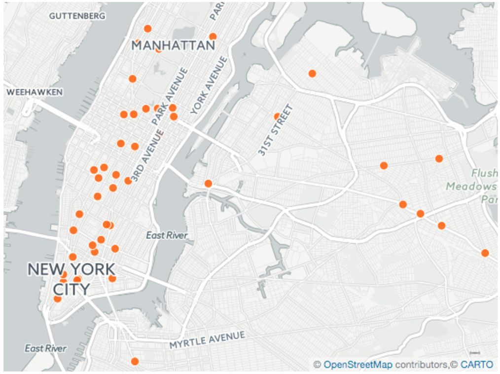
Mapped stations.
Finally, here is the final map of stations we selected:

All of theses tasks, along with presentation prep, were performed in 4 days. Some tasks took more time than expected, especially as we were all getting comfortable with pandas and managing such a large dataset (once or twice a couple of computers did freeze).
FINAL THOUGHTS
Overall, I think Benson was a good project to start with. I appreciated having a team with a diverse set of strengths, and it was also great to be able to go through a whole project in one week.
All presentations went well. It was evident that some teams were able to go deeper into the data or even combine it with additional datasets (like income or tech hubs), but overall I think we all did well.
Last but not least, great link alert! Please do yourself a favor and check out this project by The New Yorker titled “Inequality and New York’s Subway”. It graphs New Yorker’s income (utilizing census data) by subway stop. I only hope to be able to create something like this one day.